The existing site was rigid and couldn't meet MOOV's growing business needs:
Information overload
Dozens of scattered pages with confusing navigation paths and redundant content
No mobile strategy
80%+ mobile traffic with no mobile optimization
Unclear value proposition
150+ service offerings with no clear way for users to find what they needed
Can't scale
MOOV is expanding to new locations but the site structure couldn't accommodate growth
Poor conversion
Users couldn't navigate intuitively, leading to drop-off
They needed a complete digital overhaul that could clarify their offering, work for their mobile-heavy audience, and scale as they opened new clinics.
My Role
As Contract Art Director, I led visual design and UX direction while collaborating with a cross-functional team:
01
Directed overall visual strategy and UX approach for the redesign
02
Led information architecture restructuring and navigation design
03
Designed the complete responsive design system and component library
04
Directed content strategy from a visual hierarchy and UX perspective
05
Collaborated with copywriter on content structure and messaging flow
06
Worked with developer on implementation and technical feasibility
07
Partnered with content strategist and client lead to ensure business goals aligned with design decisions
My focus was translating their clinical complexity into an intuitive, premium digital experience that actually converted.
What I Built
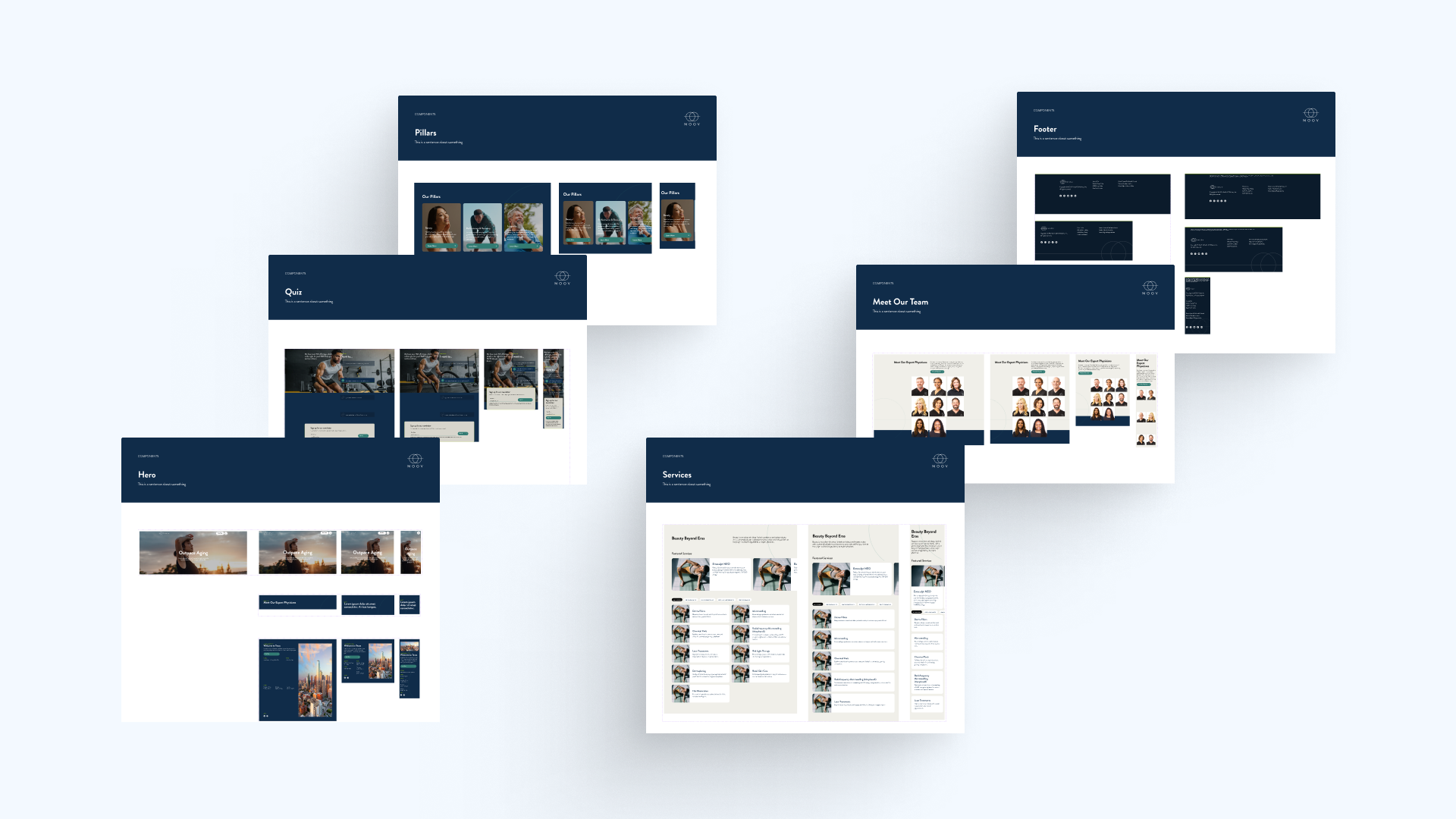
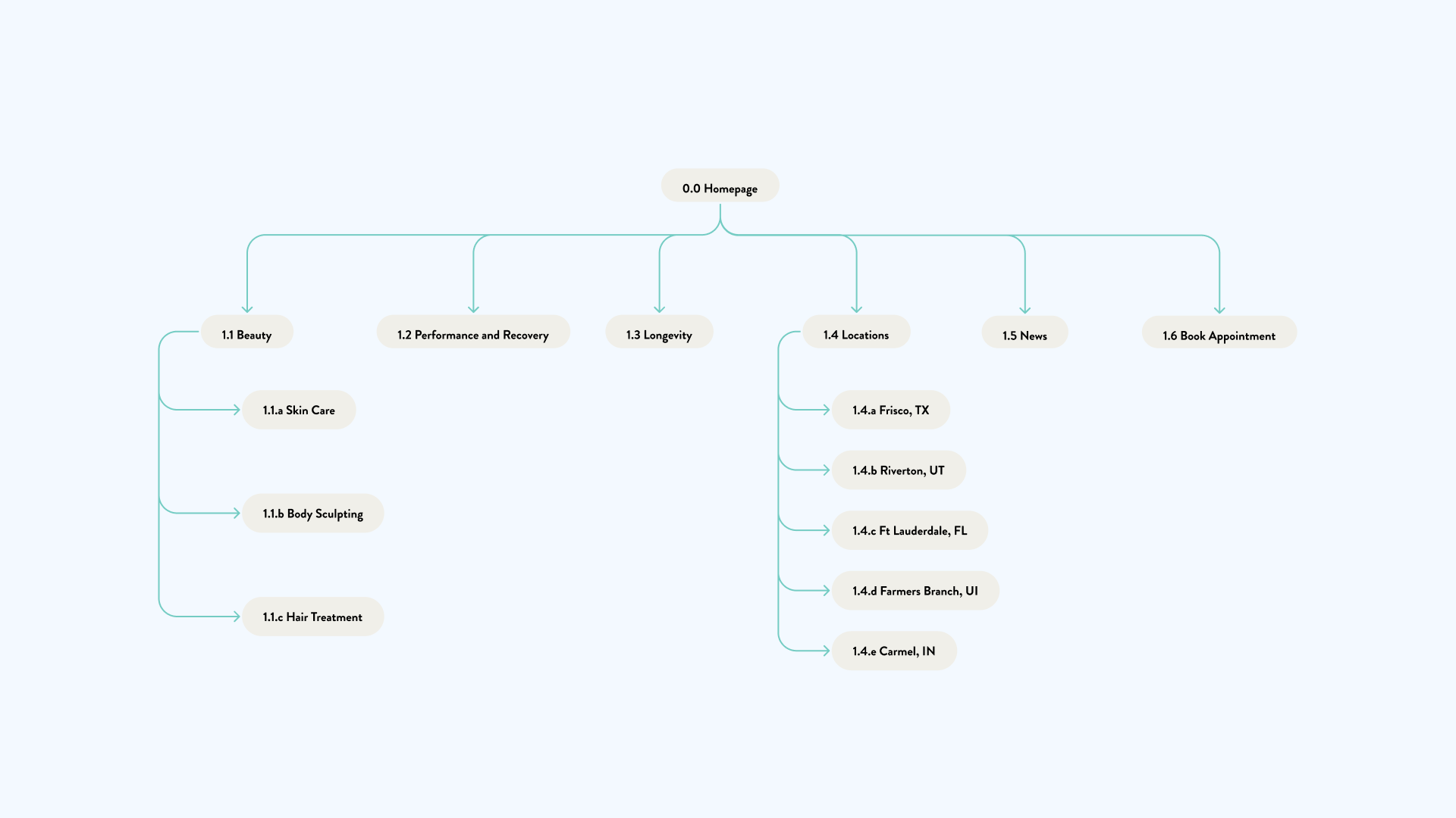
Information Architecture Restructuring
Consolidated scattered pages into a clear hierarchy organized around MOOV's three core pillars: Beauty, Performance & Recovery, and Longevity. Created focused pathways that help users understand exactly what services they need and how to access them.
Design System & Visual Language
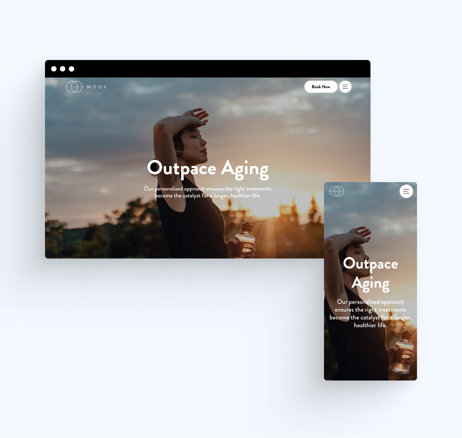
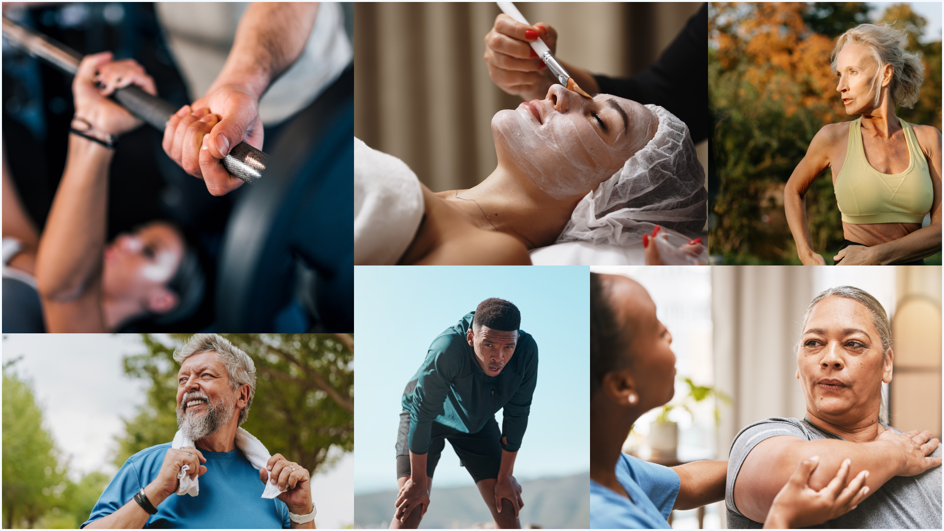
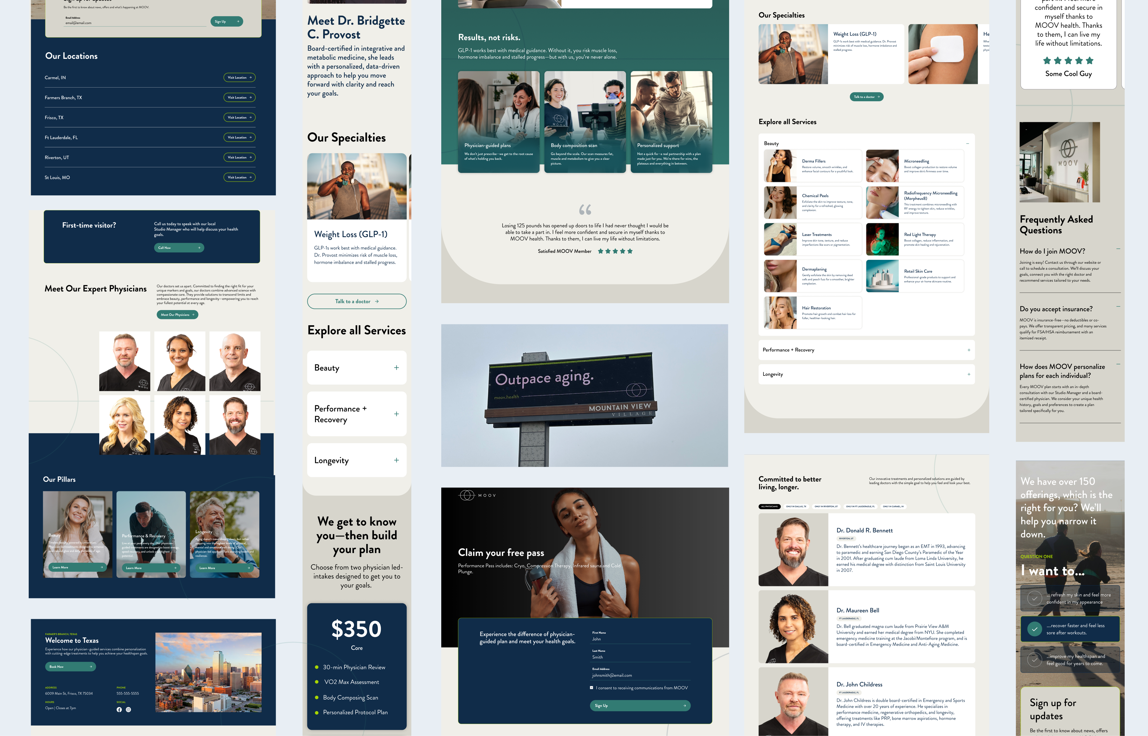
Built a mobile-first component library with visual direction that balanced premium positioning with accessibility. Directed lifestyle photography featuring diverse ages and fitness levels (not just 20-somethings), created clean layouts that felt spa-like but welcoming, and established hierarchy that made 150+ services navigable rather than overwhelming. The system communicated "aspirational wellness for real people"—professional without being clinical, premium without being exclusive.
Service Discovery Experience
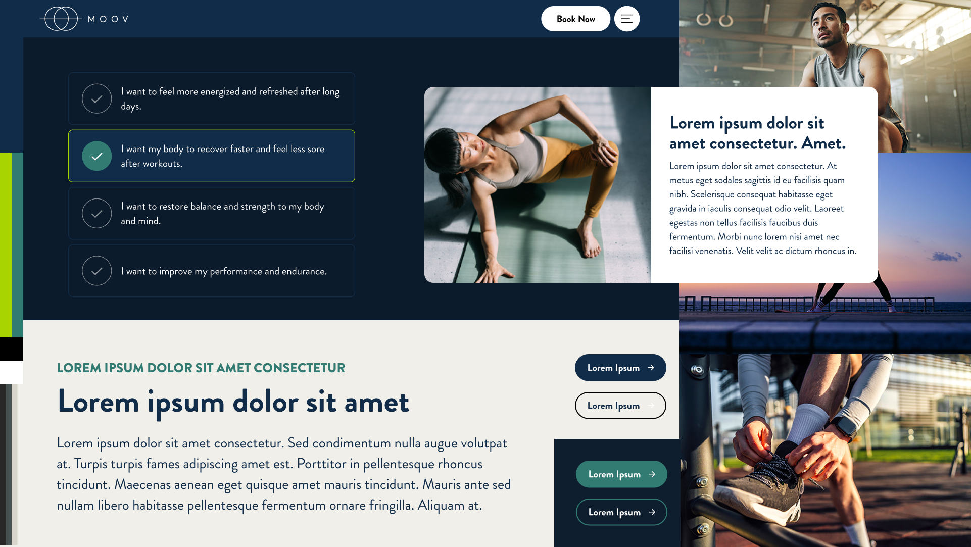
Designed a quiz system to help users navigate service offerings by asking simple questions about their goals, then providing personalized recommendations—removing the overwhelm and creating clear paths to booking.
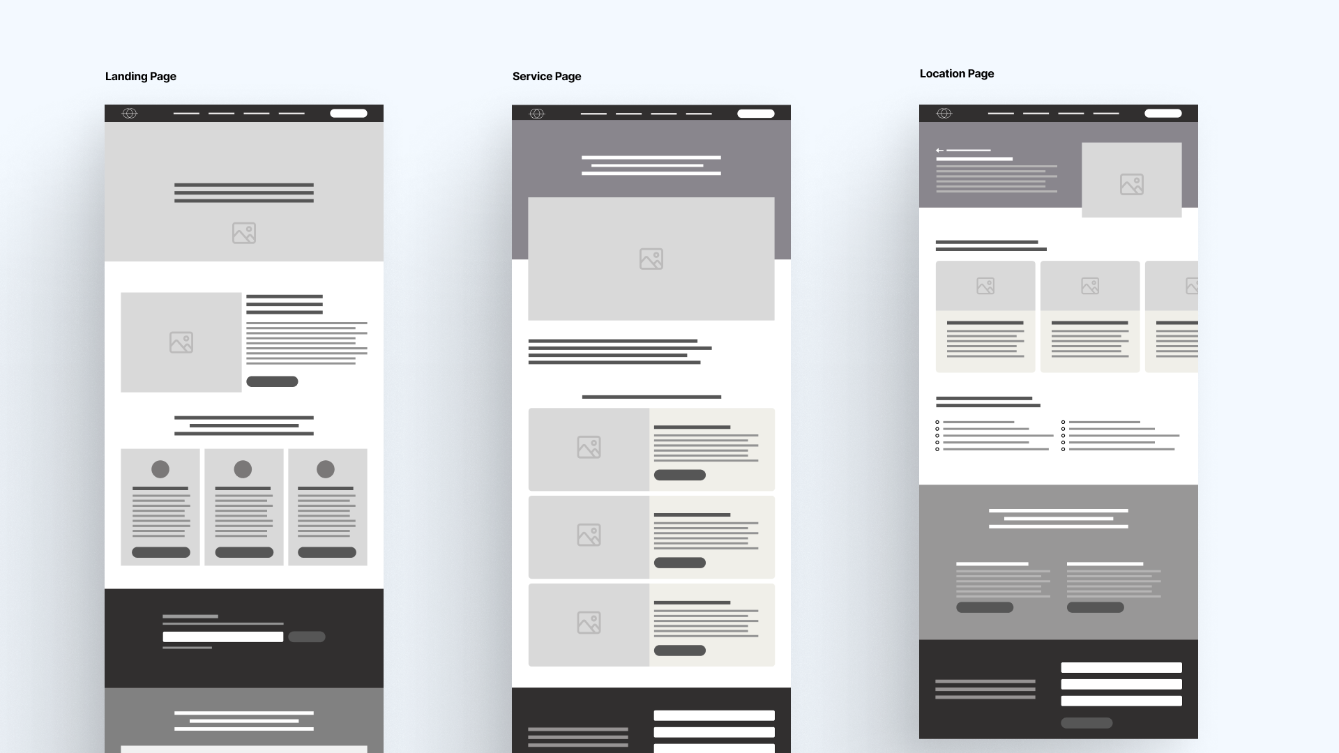
Scalable Templates
Created page templates for landing pages, services, and locations that maintained brand consistency while allowing each clinic to highlight location-specific offerings. The system proved flexible enough to expand beyond digital—from paid social campaigns to large-format outdoor advertising, including billboards.
Outcomes
Improved Engagement
66% increase in overall sessions, 133% increase in engaged sessions, 39.79% improvement in engagement rate, with 50%+ engagement across desktop and mobile.
Dramatically Better Conversion
Session conversion rates jumped from 8% to 88%, with 7,805% increase in key conversion events. Users could now navigate intuitively and find what they needed.
Scalable production
Design system successfully deployed across 6 locations, maintained brand consistency from mobile to billboard formats, and enabled marketing team to create new campaigns without custom design work.
Business Growth Enabled
The new digital presence supported MOOV's aggressive expansion, providing the foundation for multi-state growth and establishing them as a credible player in the premium wellness space.